
Here at BITEME, we love the Department of Numbers. But we have to call them out when they use a misleading graph like this one:
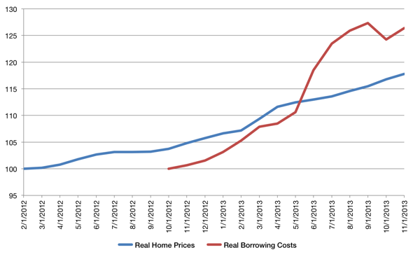
Here, they’ve set the baseline for the Y axis at 95 rather than zero, in order to exaggerate the rise in home prices and borrowing costs. Without the statistical manipulation, the lines would have been nearly flat — and boring.
Real Home Prices and Real Borrowing Costs Since the Bottom | Department of Numbers.